Scope
Logo Redesign
Business
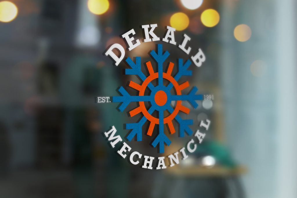
Dekalb Mechanical
Warm Up to Cool Icons
I was tasked to redesign the logo of a local Dekalb, Illinois business, Dekalb Mechanical.
Since 1991, DeKalb Mechanical has been a reliable name in heating, cooling, refrigeration, and sheet metal fabrication. They’re known for their prompt service, affordable solutions, and customer satisfaction, making them a top choice for residential HVAC needs in the Dekalb County area.
Getting Warmed Up
Discovery & Objective
With this redesign, I first analyzed Dekalb Mechanical’s current logo to help me understand what aspects of the redesign to focus on. Next I looked at design trends for HVAC business logos. After conducting research, I established my objectives.


Iconic Symbolism
Creative Process
I planned the design to convey Dekalb Mechanical’s HVAC services using “hot” and “cold” icons and colors. As I established the logomark, I found that Rockwell Bold compliments the logo’s sharp edges and conveys a masculine aesthetic.


Badge of Honor
I was inspired by badges and its symbolism of authority, services, achievement, and a special mark.
Another important element I included was the company’s established date. Highlighting their longevity, emphasizes how well-trusted and proud Dekalb Mechanical is of its history and service.
The goal was to design a logo that communicated Dekalb Mechanical’s services while incorporating the company’s core characteristics. This is done primarily through icons within the logomark, the inclusion of an established date and resemblance of a badge convey a business the audience can trust. Lastly, the redesign is modern, clean, and visually interesting. Thus, achieving the five main objectives.


More Projects